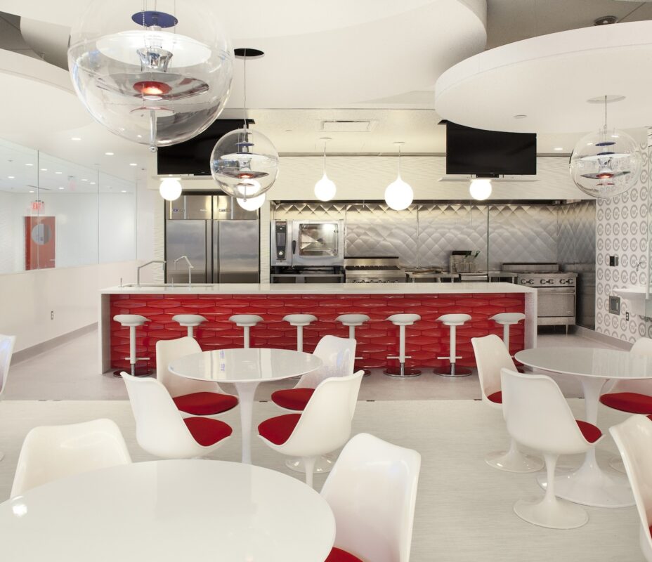
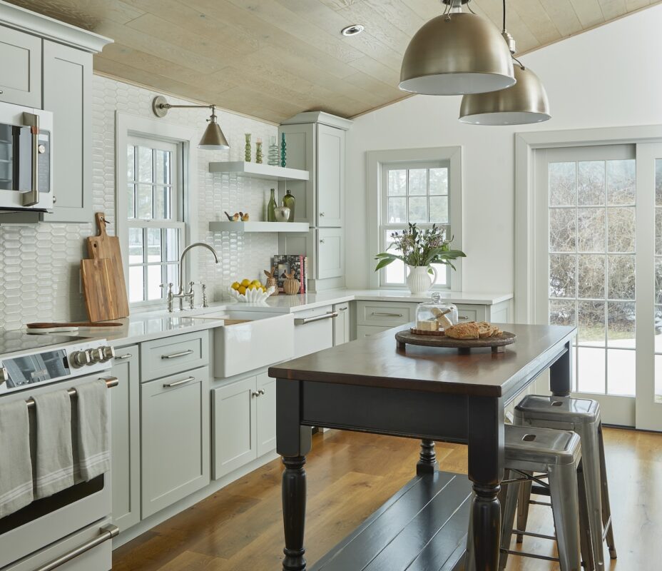
Chicago IL
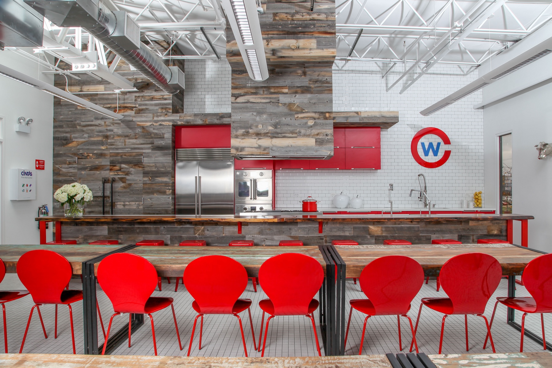
Location: Chicago, IL. A corporate office and culinary facility for The Chefs’ Warehouse, a specialty food and culinary products distributor.
Design Goal: The client wanted a workplace anchored by a true working kitchen, a space where the company’s culinary identity was not just referenced but lived, supporting product demonstrations, communal dining, and team gathering. Drawn to an energetic industrial aesthetic and the brand’s signature red, they sought an environment that felt vibrant, functional, and unmistakably tied to food and hospitality.
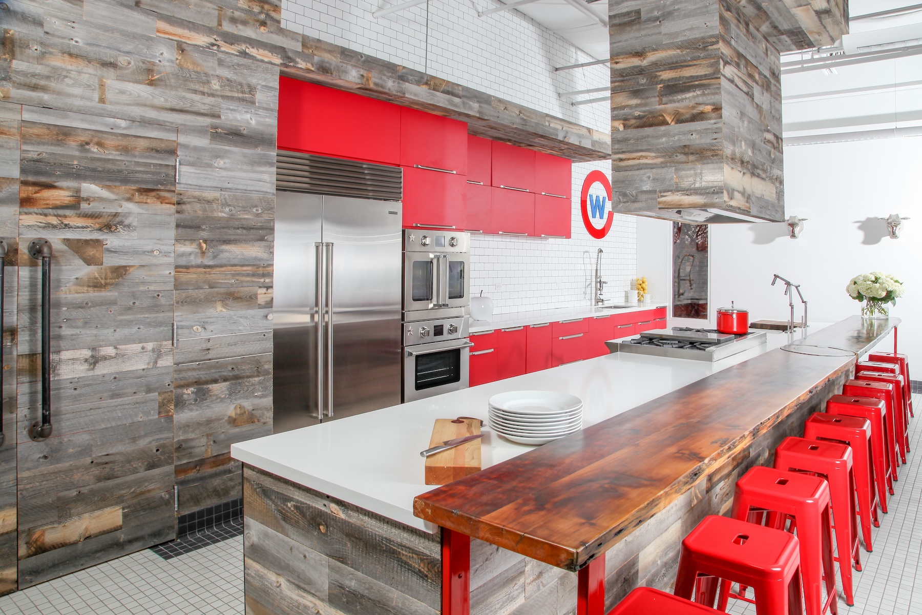
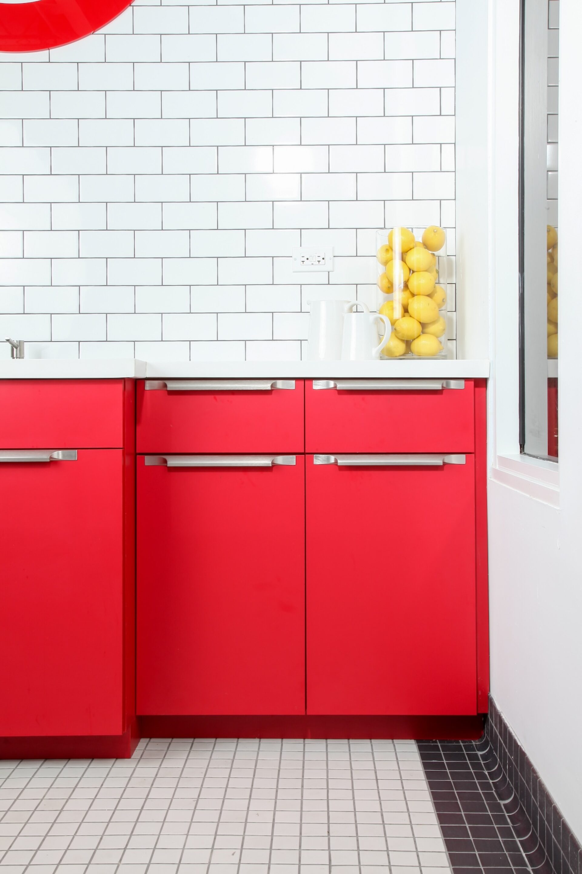
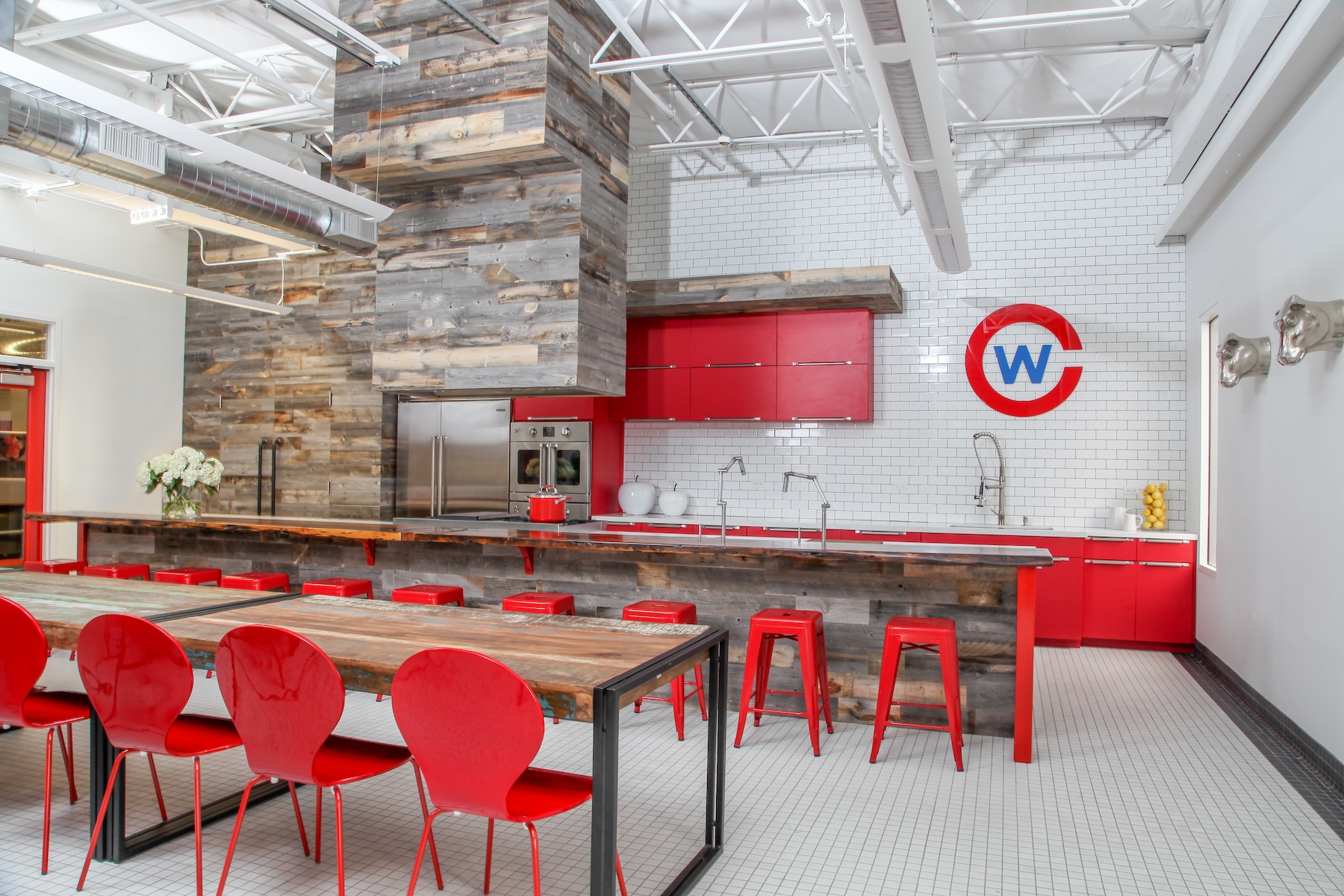
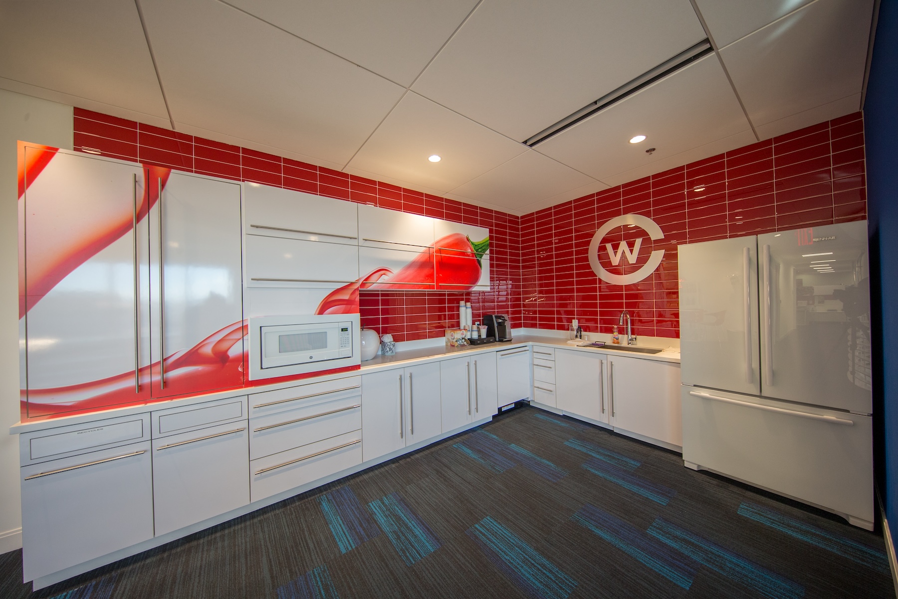
The space is industrial loft contemporary with a culinary heart, pairing raw, utilitarian materials with bold, brand driven color. The palette is built on a crisp foundation of white subway and grid tile, stainless steel, and reclaimed weathered wood, electrified throughout by the company’s signature primary red and blue.
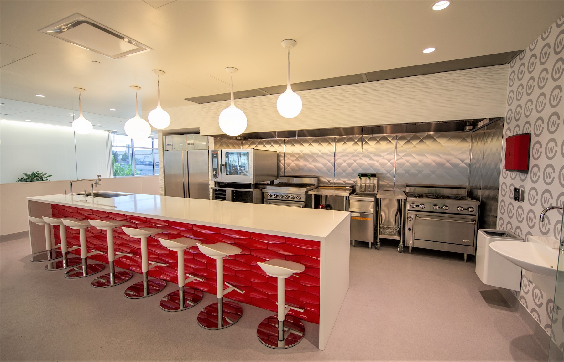
Materials are honest and professional grade, from commercial appliances and quilted stainless backsplashes to barn wood cladding and white quartz counters.
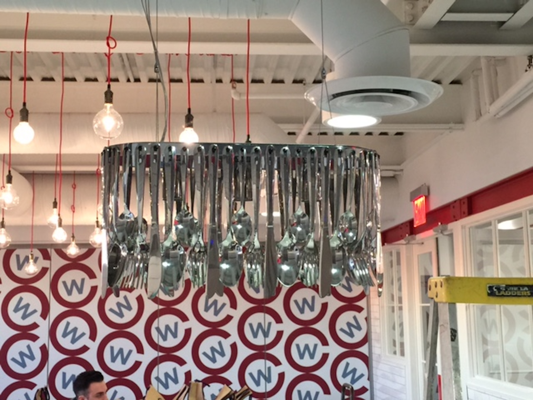
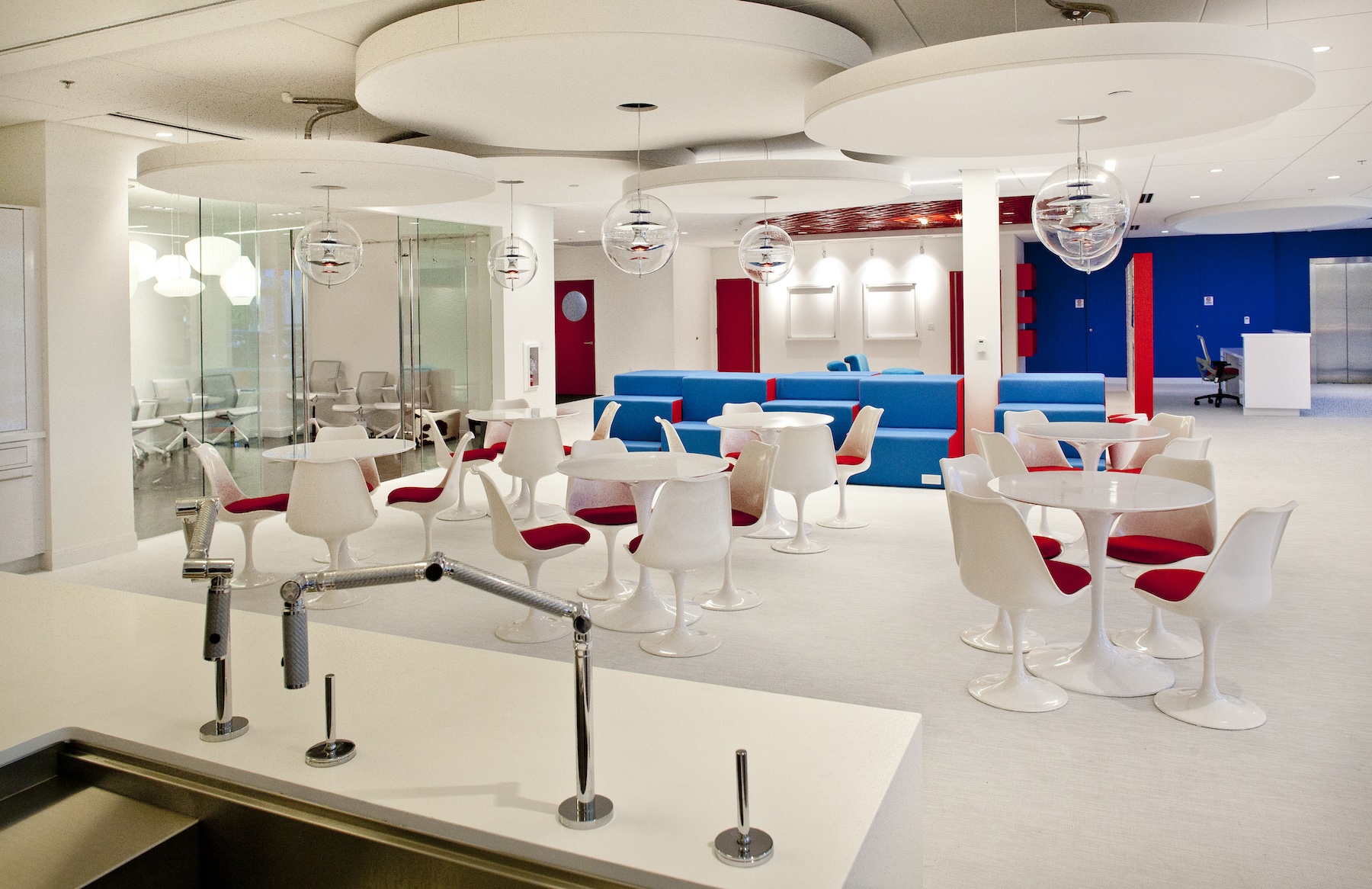
Signature details give the space its spirited, food forward character: high gloss lacquered red cabinetry, reclaimed wood communal tables and waterfall hoods, a flatware chandelier, mirrored sphere and globe pendants, polished steer head wall mounts, and integrated brand logos and signage. Tonally the work is bold, energetic, functional, and convivial.
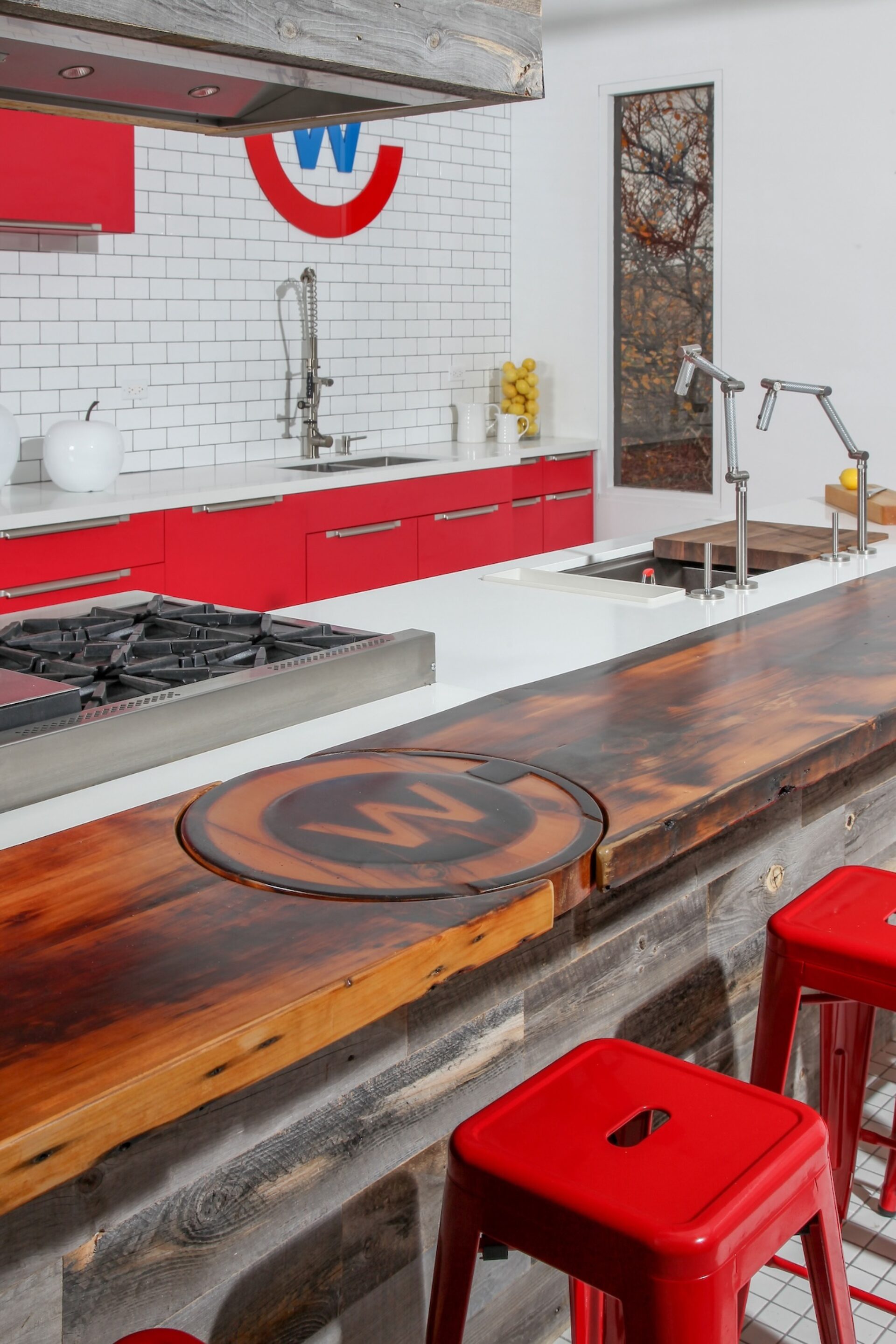
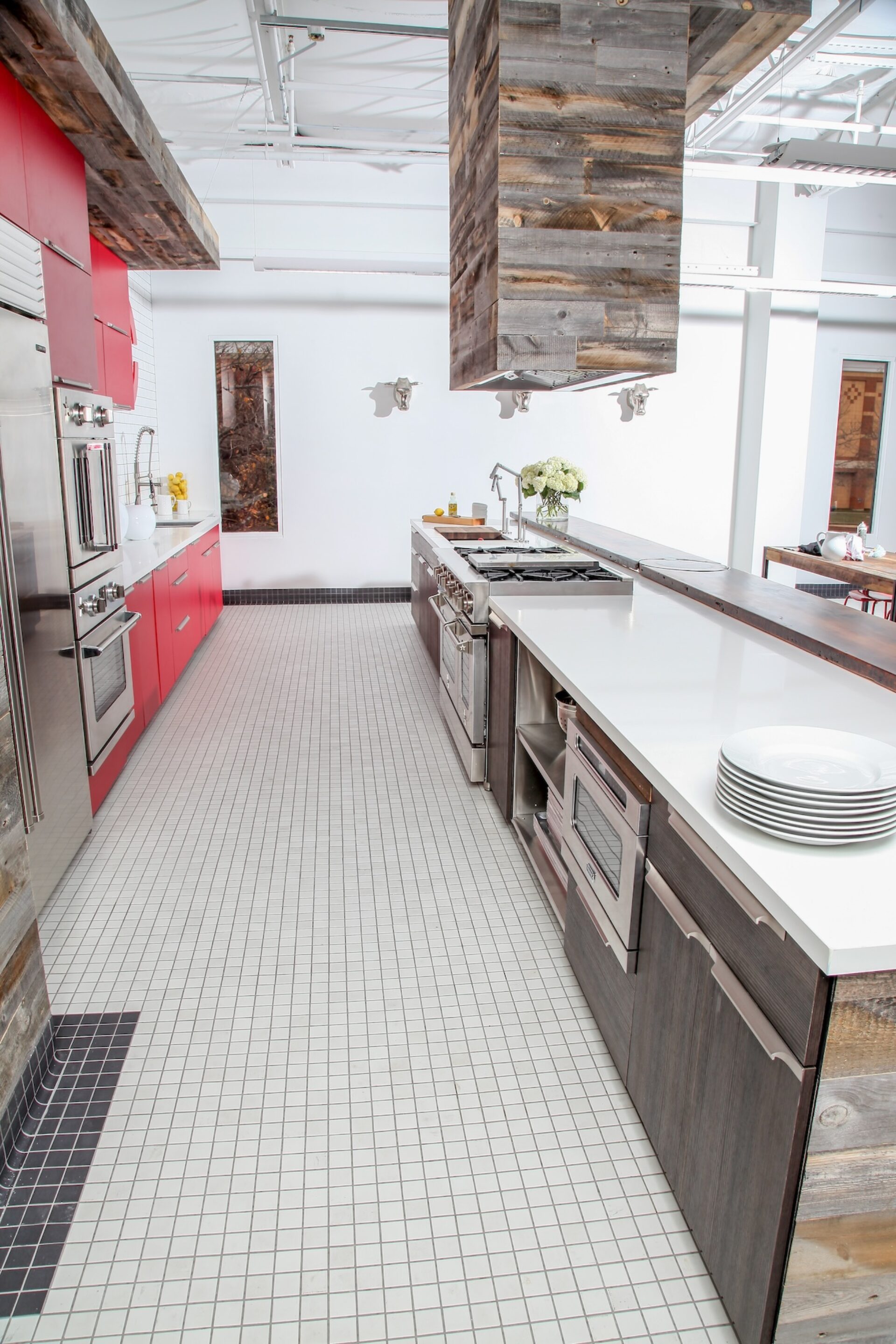
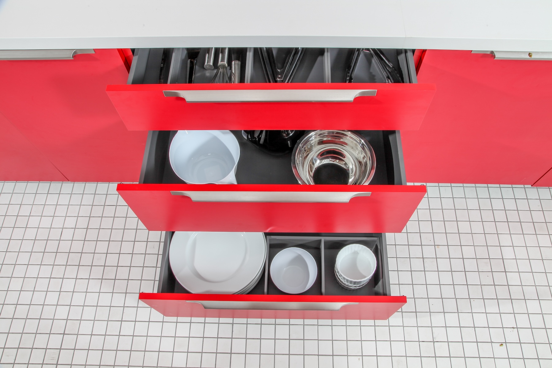
Our scope spanned space planning, custom millwork and cabinetry design, finish and material selection, lighting design, branding and environmental graphics, and furnishing. We designed the facility around its commercial kitchens, balancing the durability and performance of a professional culinary environment with the warmth and personality of a gathering place.
Long communal tables and counter seating encourage the team to cook, taste, and connect together, while reclaimed wood and industrial finishes ground the brand’s bold color in texture and authenticity. Lighting was layered for both function and drama, weaving together statement pendants, the custom flatware fixture, and clean linear sources against the open structural ceiling.
Brand identity is woven throughout, from logo medallions to partner signage. The result is a distinctive, high energy corporate culinary space that brings the company’s food first culture to life, a working kitchen and gathering hub as bold as the brand it serves.

“Julie is full of great resources and a pleasure to work with. But for me her best quality is her great taste, and ability to pull off the WOW factor in every space she has done.”
—M.P.